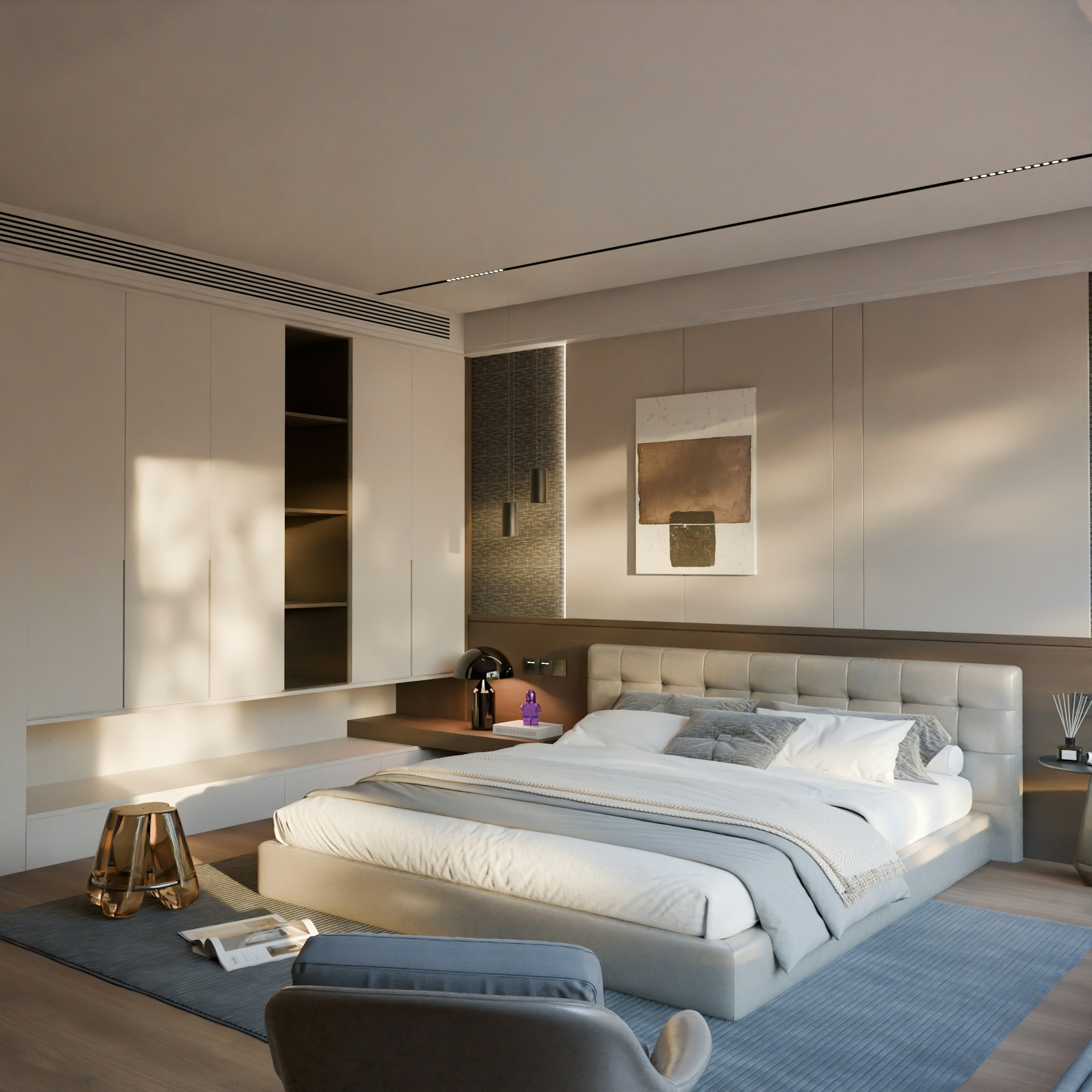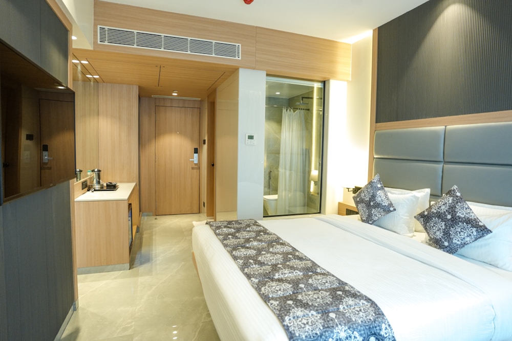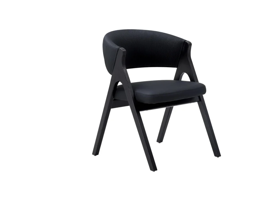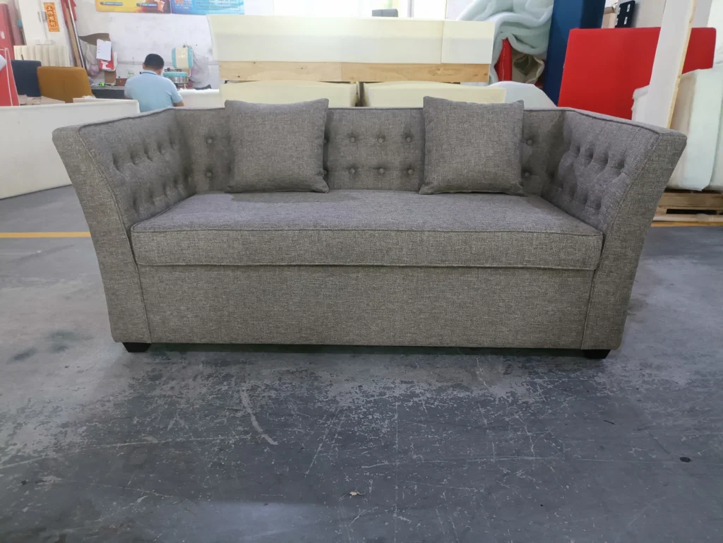

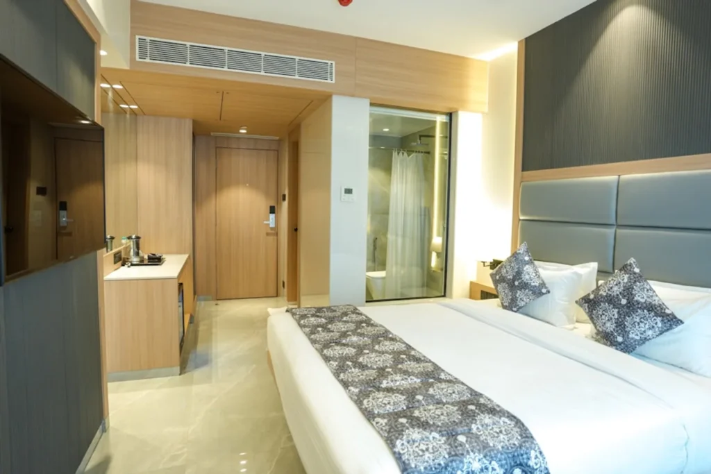
Good hotel furniture design coordinates beds, headboards, nightstands, wardrobes, desks, sofas, chairs and tables as a collection. If each piece is selected separately, wood tones can nearly match but still conflict, metal finishes can compete, fabrics can feel unrelated and furniture shapes can belong to different styles. A successful scheme creates visible connections without making every item identical. Start with one design direction, build a controlled finish palette and repeat a limited number of forms or details across the spaces.
Send the mood board, interior renderings and preferred finish references together to discuss a coordinated furniture palette.
Start with the Hotel’s Overall Design Direction
Before selecting furniture finishes, confirm the hotel positioning, target guests, interior concept, room size, lighting, flooring, wall colors, decorative materials and public-area atmosphere. Furniture does not sit against a blank background. A walnut nightstand may look warm beside one floor and overly red beside another; a beige fabric may turn grey or yellow under different lighting.
The project designer controls the complete interior direction. HUAXUAN’s furniture-focused role is to interpret the approved concept through product materials, colors, dimensions and details. The guide on choosing hotel furniture by property type can help establish priorities before this detailed coordination begins.
Choose a Main Furniture Color Palette
A practical starting palette often uses one main wood tone, one supporting metal finish, one primary upholstery color and one or two accents. This is not a fixed rule, but it forces clear hierarchy. If every chair, cabinet and table introduces another similar brown, grey or gold, the room quickly loses intention.
| Example combination | General visual effect | Supporting metal direction | Possible accent direction |
|---|---|---|---|
| Light wood + beige fabric | Airy, quiet and approachable | Black, soft bronze or brushed stainless details | Warm white, muted green or dusty blue |
| Walnut + warm grey fabric | Grounded and contemporary | Bronze, champagne or black details | Muted rust, blue or green |
| Dark wood + cream upholstery | High contrast and composed | Brushed gold, bronze or black details | Deep blue, burgundy or forest green |
| Black metal + neutral fabric | Graphic and modern | Keep other metals limited | Ochre, terracotta or one brand color |
| Brushed gold + muted color upholstery | Refined and expressive | Use the warm metal as a controlled repeat | Muted green, blue, plum or rose |
These combinations are examples rather than standards. Light wood and beige fabric can feel calm; walnut and warm grey can feel grounded; dark wood and cream can create contrast; black metal can sharpen a neutral scheme; and brushed gold can support muted green or blue. The correct direction depends on the approved concept, surrounding materials and lighting.
How to Coordinate Wood Finishes
Common directions include light oak, natural ash, walnut, dark walnut, smoked tones, painted finishes, veneer, melamine and laminate. Solid-looking color is not the only issue: grain scale, grain direction, sheen and edge treatment also affect whether two pieces look related. A wardrobe door and a small nightstand may use different substrates but can still achieve a related visual finish.
Limit the number of nearly matching woods in one room. Beds, nightstands, wardrobes, desks and TV units can use the same finish or a planned light/dark relationship. When different materials are required for construction or maintenance, compare physical samples together. Screen images and renderings are not reliable enough for final color approval. The materials and finishes page outlines HUAXUAN’s furniture-focused selection process.
How to Coordinate Metal Finishes
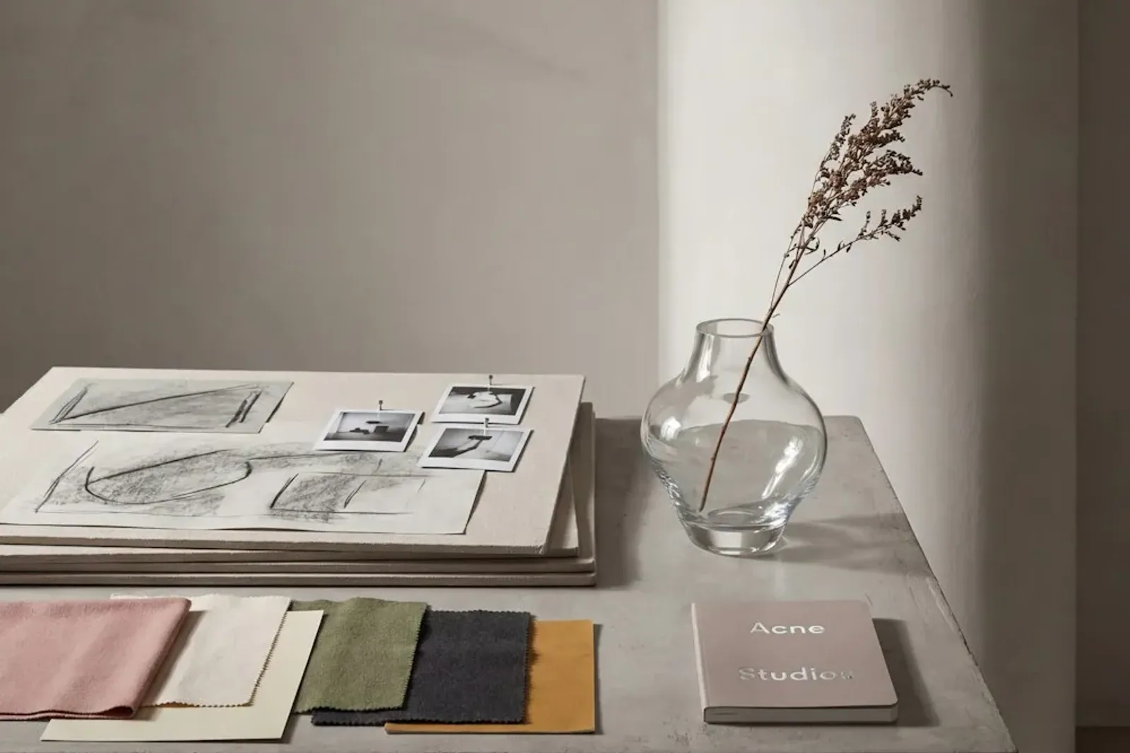
Metal may appear on sofa and chair legs, table bases, decorative trims, handles and bedside details. Black powder coating, brushed stainless steel, brushed gold, champagne gold, bronze, chrome and antique-style finishes each create a different visual temperature. Choose a main metal direction and control exceptions.
Not every metal component must be identical, especially when hardware has a functional requirement. The visible finishes should still look intentional when viewed together. For example, a warm champagne table base can relate to bedside trim and wardrobe handles, while hidden hardware remains purely functional. Avoid using chrome, black, gold and bronze as separate decorative statements in one compact guestroom.
How to Select Upholstery Colors and Textures
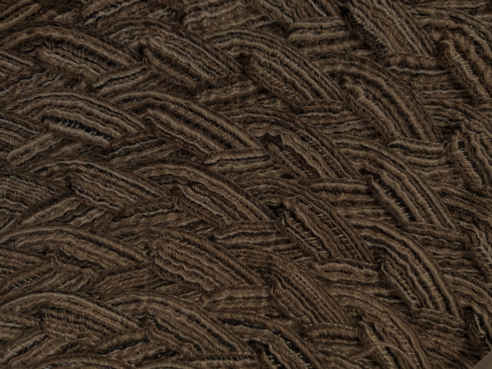
Furniture upholstery may include woven fabric, velvet-like fabric, bouclé-style fabric, PU leather, genuine leather, performance fabric or outdoor fabric. These names describe broad categories rather than guaranteed performance. Project-specific requirements and supplier information must be reviewed without inventing a test level.
Large furniture generally benefits from stable base colors because sofas, beds and banquettes occupy significant visual area. An accent chair can carry a stronger color. A headboard can connect the bed to the wall palette. Dining chairs should coordinate with table finishes and banquettes. Lobby furniture can use more contrast than guestroom seating, provided the fabric family and repeated details keep the composition related.
How to Match Beds, Headboards and Nightstands
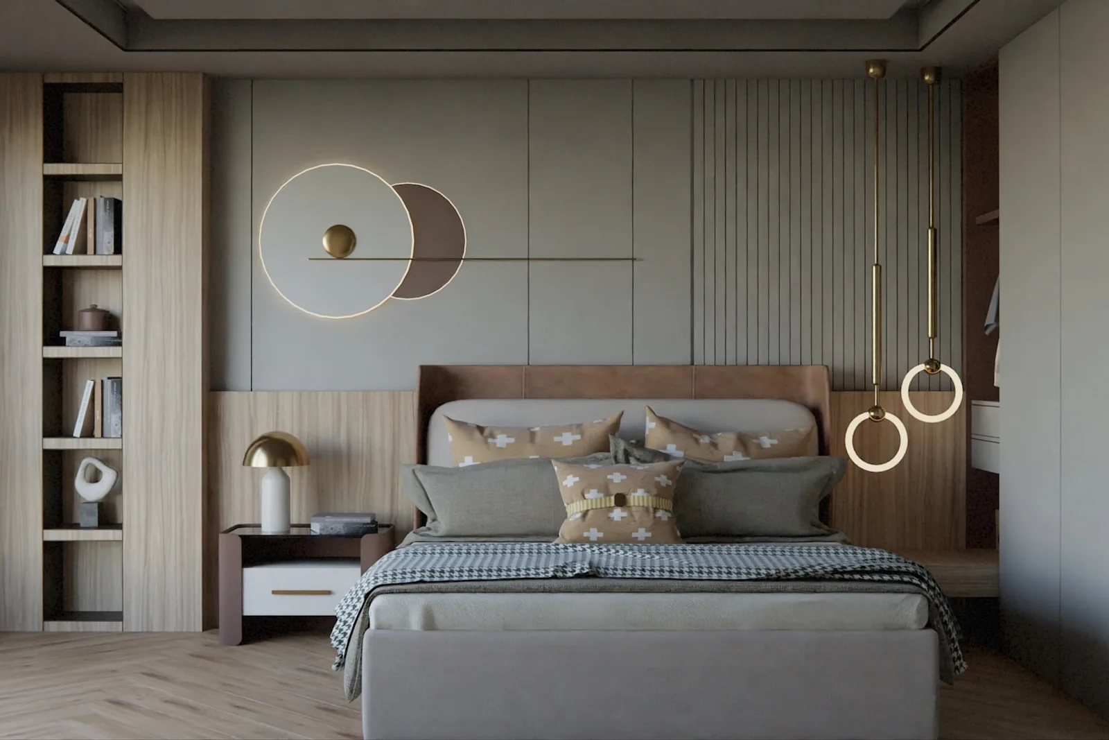
The bed wall is normally the strongest guestroom composition. Headboard width should relate to the bed, wall and bedside arrangement. Nightstand height should work with the finished mattress. Wood and upholstery should share compatible undertones, and visible metal details should connect with nearby furniture. Bedside panels, floating nightstands and standalone tables should not look like separate projects.
Upholstery seams can become a useful repeating detail. A vertical channel, piping line or stitched border on the headboard may reappear more subtly on a bench or lounge chair. Repeat the idea, not necessarily the exact pattern. See the hotel beds and headboards range when planning the complete bed-wall family.
How to Match Sofas, Lounge Chairs and Coffee Tables
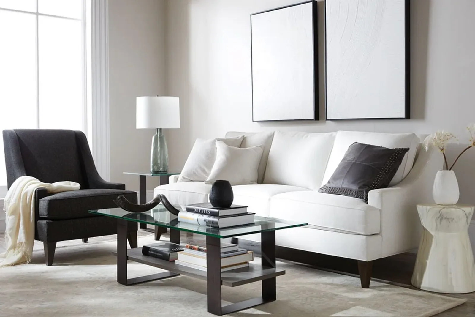
Sofas and lounge chairs can relate through leg finish, arm geometry, curve radius, upholstery color family, piping or stitching. They do not have to use the same fabric or silhouette. In fact, a sofa in a stable neutral and a lounge chair in a deeper accent often create better hierarchy than a perfectly matched suite.
Coffee and side tables should bridge the seating composition. A table base can repeat the seating legs; a top can connect to casegoods or wall materials; rounded corners can echo curved arms. Use the custom sofa collection as a starting point for form and upholstery adjustments, then review tables and chairs beside the sofa rather than from separate catalogues.
How to Coordinate Casegoods Across the Hotel Room
| Casegood | Coordination elements | Risk to avoid |
|---|---|---|
| Wardrobe | Main wood or painted finish; door proportion; handle family | Too many panels, trims or unrelated handles |
| Minibar cabinet | Repeat wardrobe or desk finish; coordinate ventilation openings discreetly | Treating it as a separate appliance box |
| TV cabinet | Share edge profile, base and metal accents with other casegoods | A visually heavy unit that dominates the bed wall |
| Desk | Connect finish and leg/base language to bedside and TV pieces | Using an office-style desk unrelated to the room |
| Nightstand | Relate height, finish, handle and bedside panel details | Near-matching wood that looks accidental beside the headboard |
| Luggage bench | Repeat upholstery or base finish from the room collection | Introducing a new fabric and metal finish for one small item |
| Console | Use the same finish family with a lighter proportion | Copying the wardrobe form at an unsuitable depth |
Casegoods often occupy more wall area than upholstered seating, so small finish differences become obvious. A controlled edge profile, handle family, metal trim, base design, door proportion or repeated panel detail can connect the wardrobe, minibar cabinet, TV unit, desk, nightstand, luggage bench and console. Do not apply every detail to every product; choose the elements that support scale and function.
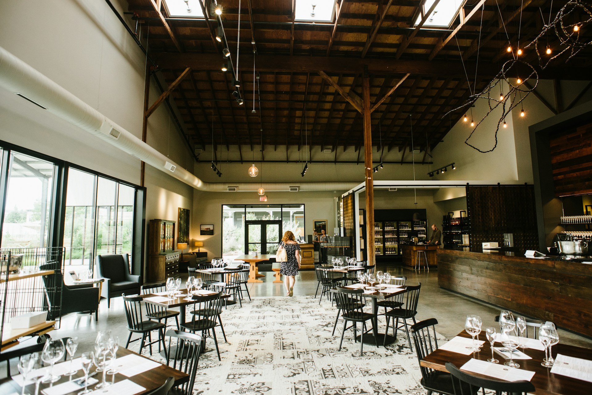
How Guest Rooms and Public Areas Can Share One Design Language
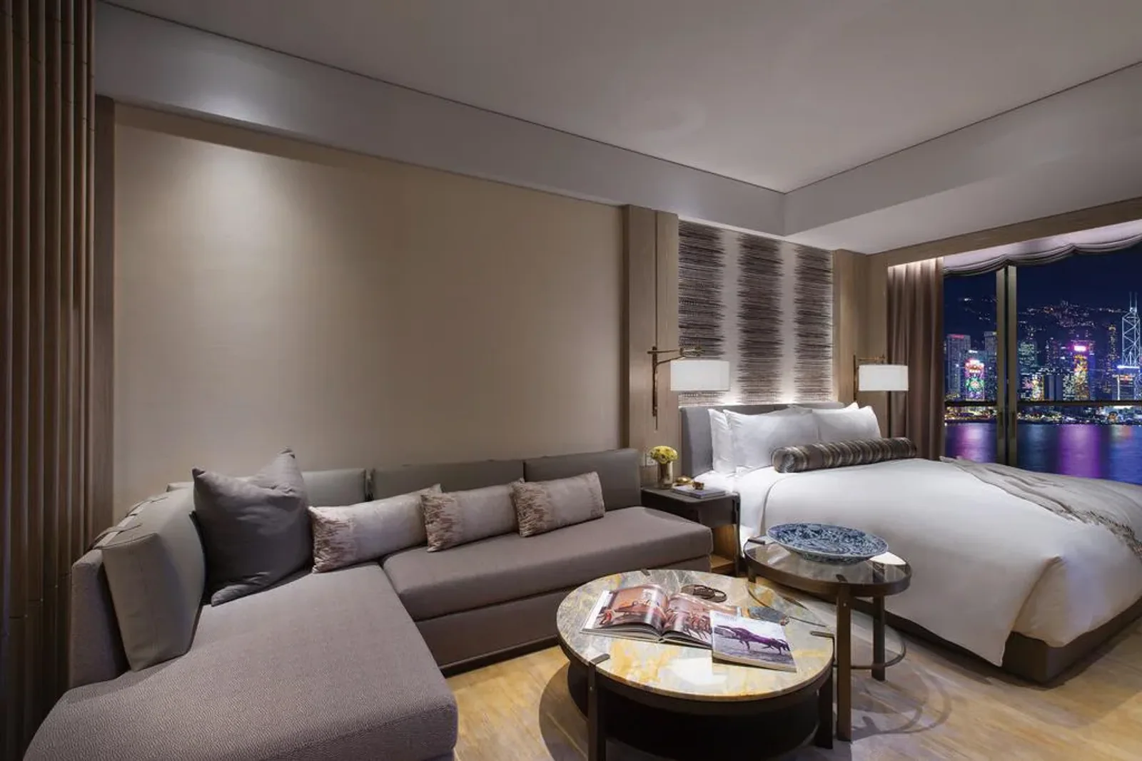
Guestrooms, lobbies and restaurants do not need identical furniture. They can share wood tones, metal finishes, curved forms, upholstery colors, stitching, decorative lines or table-base shapes. Guestrooms may use calm neutral furniture; the lobby can amplify the accent color; the restaurant can repeat the wood or metal; and suites can use a richer version of the room palette.
The connection should be recognizable without becoming repetitive. Select two or three signals that can travel: perhaps a walnut tone, a champagne metal and a softened curve. Then adjust color strength, seat posture and furniture scale for each area. The room-by-room hotel furniture guide helps determine which categories need this shared language.
Furniture Color Ideas for Different Hotel Styles
| Hotel style | Suggested color direction | Wood direction | Metal direction | Furniture form |
|---|---|---|---|---|
| Modern hotel | Warm or cool neutrals with one accent | Light oak, walnut or smooth painted finish | Black, brushed stainless or restrained warm metal | Clean planes, gentle curves and controlled seams |
| Boutique hotel | Distinctive base palette plus one memorable accent | Concept-specific wood or painted finish | A selected metal repeated on key details | Statement forms balanced by compact practical pieces |
| Luxury hotel | Layered neutrals with deep or muted accents | Refined veneer, painted finish or dark wood | Champagne, bronze or brushed stainless used precisely | Composed proportions, tailored upholstery and detail control |
| Resort hotel | Relaxed neutrals, nature-derived or concept-led colors | Light, weathered or rich wood according to concept | Powder-coated or corrosion-appropriate exterior finishes | Comfortable forms and indoor-outdoor continuity |
| Business hotel | Calm neutrals with a clear brand accent | Repeatable medium wood or durable surface finish | Black or brushed metal in limited locations | Efficient profiles, integrated work and storage |
| Minimalist hotel | Low-contrast tonal palette | Light wood or smooth monochrome surfaces | Discreet metal with minimal visual interruption | Simple profiles whose proportion and alignment carry the design |
| Art deco-inspired hotel | Deep jewel or muted tones with warm contrast | Dark wood or lacquer-like painted direction | Champagne, bronze or brushed gold | Rhythmic curves, channels and geometric lines |
| Tropical hotel | Warm neutrals with green, clay or ocean accents | Natural-looking wood direction chosen for the project | Matte, dark or exterior-appropriate finishes | Relaxed curves, texture and open-looking forms |
Each row is a design direction, not a compulsory formula. A tropical hotel does not always require rattan-inspired forms; a luxury hotel does not always need warm gold; and a minimalist room is not automatically white. The concept, location, architecture and brand should decide how the palette is interpreted.
How to Avoid a Hotel Room Looking Too Plain
A controlled palette can still have depth. Add one accent chair, contrasting cushions, textured upholstery, decorative stitching, a statement headboard, selected metal details or several shades of one color. Mixed materials work when they belong to the same hierarchy. For example, a neutral upholstered bed, walnut casegoods and one muted blue chair can feel layered without becoming busy.
Concentrate detail where it will be seen. If the headboard is the focal point, let nightstands and the TV unit support it. If the lounge chair is the accent, keep the sofa or bed upholstery quieter. Not every surface needs a feature. Visual rest is part of a sophisticated composition.
If the room feels either flat or overdesigned, share the rendering and proposed swatches so the furniture details can be ranked as focal, supporting or neutral elements.
How to Avoid Too Many Furniture Styles
- Do not mix classic and minimalist furniture unless a shared line, finish or proportion connects them.
- Avoid several unrelated or nearly matching wood finishes in one room.
- Limit visible metal colors and decide which one is primary.
- Do not choose every product from a separate catalogue without comparing them together.
- Approve fabric from physical samples, not only digital images.
- Reserve decorative details for focal products instead of adding them everywhere.
- When using several reference pictures, extract common principles before developing products.
A simple furniture coordination sheet can record the main wood, supporting wood, metal, base upholstery, accent upholstery, edge profile, handle family and repeated detail. Place every proposed product beside that sheet. If an item adds a new finish or style, decide whether the difference is necessary and where it will repeat.
How HUAXUAN Helps Coordinate Custom Furniture
Customers can provide mood boards, renderings, reference pictures and material samples. HUAXUAN can adjust existing furniture designs, select fabrics and finish directions, and repeat approved design elements across related products. Beds, headboards, sofas, chairs, tables and casegoods can therefore be developed as a coordinated furniture group.
This work remains furniture-specific. The project designer determines the complete interior concept, and the customer approves the final palette. HUAXUAN supports the translation of that approved direction into manufacturable furniture materials, dimensions and details through its custom furniture capabilities.
FAQ
How many colors should be used in a hotel room?
There is no mandatory number. A practical starting point is one main wood, one visible metal, one base upholstery color and one or two accents. More colors can work when their hierarchy and repetition are clearly controlled.
Should all hotel furniture use the same wood finish?
Not necessarily. The room can use one main wood and a planned supporting finish. Avoid several near-matching woods that appear accidental, and compare grain, sheen, undertone and edge treatment on physical samples.
Can sofas and chairs use different fabrics?
Yes. A sofa and chair can use different fabrics while sharing a related color family, leg finish, curve, piping or stitching. This often creates better hierarchy than making every upholstered piece identical.
How can guest rooms and lobbies share the same style?
Repeat selected signals such as the main wood tone, visible metal, curved form or stitching detail. Guestrooms can use quieter colors while the lobby uses stronger accents and larger-scale versions of the same ideas.
Can furniture colors be customized?
Furniture upholstery, wood tones, painted finishes and visible metal finishes can be selected or adjusted for the approved project direction. Final decisions should be confirmed with physical samples.
Can furniture be matched to an interior rendering?
Renderings are useful for identifying proportion, color relationships and design details. They should be supported by drawings, finish references and samples because rendered color and scale may differ from physical materials.
Need Coordinated Furniture for a Hotel Project?
Send HUAXUAN your renderings, mood boards, reference images and preferred colors. We can help adapt beds, headboards, sofas, chairs, tables and casegoods into a more consistent furniture collection while leaving complete interior design responsibility with the project’s appointed design team.
Share the proposed wood, metal and fabric directions with the furniture list to review how the categories can belong to one collection.